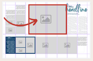
5 ways to improve your yearbook spreads right now

I’m sure you’re all very busy getting your yearbooks finished up and ready to send it off to the presses. The to-do list is a mile long, there isn’t enough coffee in the world to sustain deadline days, and the staff is frantically gathering content, editing photos, interviewing students, and designing pages. All those templates with good intentions you made in the fall can sometimes turn into chaos once your staff is in production mode. Sometimes we sacrifice a spread looking it’s best just so we can consider it done.

So – before you hit “publish,” let’s take a look at your spreads and see if there are any (quick) ways you can improve them.

1. analyze element hierarchy

DOMINANT PHOTO

Make sure one photo is clearly 2-3x larger than all the other elements on the page.
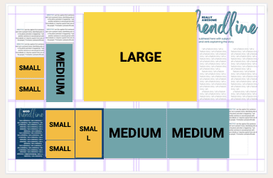
VARIED PHOTO SIZES

Mix it up! Your spread should have a balanced combination of small, medium, and large photos.

2. GO ACROSS THE GUTTER

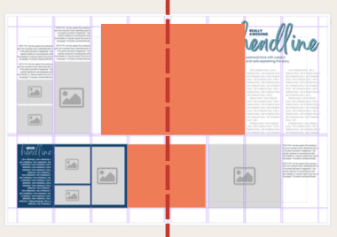
Make sure at least one element goes across the gutter so your design is one cohesive spread, not two individual pages.

3. MIND YOUR MARGINS

EXTERNAL MARGINS

Do all elements fit within the margins, unless they are intended to bleed off the page?
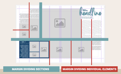
INTERNAL MARGINS

  • All elements should have “room to breathe” and not be too close to each other
  • Consistent spacing between individual elements
  • Larger spacing between modules/sections

4. STORYTELLING

ALTERNATIVE COPY

Never force a story if it doesn’t naturally fit with the content. It will be hard to write (and even harder to read) – so tell the story in a different way!

SECONDARY COVERAGE

Dig deeper and add a module that features a unique aspect of the spread topic. Even better if you can tie it to your theme!

POSSIBLE STORY FORMATS

Consider which formats would work best for your content’s main story and secondary story.

  • Q&A
  • Timeline
  • Statistics
  • Graphs/Charts
  • Before, During, After
  • Anatomy of …
  • Extended Quotes
  • Mini Story
  • Compare/Contrast
  • Numbered List
  • How-to
  • Then & Now
  • Advice
  • Table
  • Rating
  • List
  • Fast Facts
  • Checklist
  • Survey
  • Illustration
  • Infographic
  • Interactive Content
  • Calendar
  • Pros/Cons
  • Map
  • Step-by-Step
  • Recipe
  • Quiz
  • Flashback
  • Diagram
  • Photo Collection

5. headline design

DESIGN HEADLINES INTENTIONALLY

  • Stack words individually
  • Use different fonts (& weights)
  • Use different colors
Obviously, this is a super long and extra headline – but just an example to show how you can “cuddle” words together using the negative space of the letters!


BONUS: Make something giant

JUST TRY IT

If you’re struggling to spice up a spread, try making one element huge and play around with layering to see how it looks. If you hate it – that’s ok! It can be helpful to see the spread in a different perspective.

  • Use a full or partial background color
  • Super large headline, layered over dominant photo
  • Full-page sized cutout

One Response

Drop a comment

More posts